From: ClemsonTigers.com –
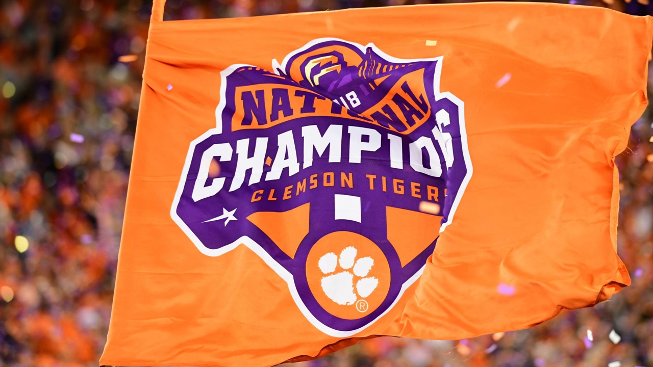
If there hadn’t been bad weather in Orlando that fateful day in June 2017, Clemson graduate and graphic designer T.J. Harley may never have been the one to design the 2018 National Championship logo for his alma mater.
Harley had just flown into Orlando for a college athletics conference and headed to baggage claim to pick up his luggage. Because of the bad weather, the airline wasn’t bringing bags off the plane and so he was stuck waiting. Good thing, because waiting for luggage alongside him were several Clemson Athletic Department officials who were in town to take part in Tim Bourret’s induction into the COSIDA Hall of Fame. Harley and the crew had worked together previously when Harley was the creative director at the Collegiate Licensing Company (now IMGCL), which had Clemson as a client.
The news in baggage claim came that there would be a long delay before passengers could get their luggage.
“Let’s go grab a bite to eat and catch up,” the group told Harley.
The group talked for over an hour — Harley about he how started his own design company (Harley Creative) with clients like Hanes, Mercedes-Benz Stadium and the College Football Hall of Fame and the Clemson group about the transformation for the athletic department’s communications and marketing efforts that led to Clemson becoming an industry leader in digital media. The Clemson contingent invited Harley to visit Clemson and meet members of the Creative Solutions department, including lead graphic designer Jeff Kallin.
Kallin, of course, designed Clemson’s famous 2016 National Championship logo. He was familiar with Harley’s work and was aware that he was a fellow Clemson grad. The group got together in Clemson about a month later and talked shop.
But 16 months later when the Tigers were in the middle of another undefeated championship run, Clemson came calling.
“T.J. is very proud of his Clemson roots and is known in the design community as one of the best,” Kallin said. “When I was approached by our administration about designing a logo again, I suggested we reach out to T.J. It just made sense to offer it to him.”
But would Harley take the project?
“Of course, there was no way I was saying no to that,” Harley said.
Once Harley was on board, it was time to get to work. But projects like these create a dilemma — the Clemson Football team was weeks and wins away from needing a Championship logo but there is still a need for the appropriate time to brainstorm, draft, review and edit before the logo is ready to be published and placed on retail items. There are plenty of celebratory t-shirts that never see the light of day after the team featured didn’t actually end up winning the championship and the same happens with logos — one gets made for each of the four College Football Playoff teams but only the winner’s gets used.
So, the timeline went like this: Kallin reached out to Harley after the team won the ACC Atlantic Division and then the design and review process kicked into high gear after the Tigers won the ACC Championship. Harley sent along eight initial concepts and the group reviewed about 30 variations before narrowing it down to the final selection.
The group involved in the process was small — Harley, Kallin, Associate Athletics Director Tim Match, Deputy Director of Athletics Graham Neff and Director of Athletics Dan Radakovich.
“There was actually a lot more purple in one of the final versions of the logo but Dan suggested it needed more orange,” Harley remembers. “It turned out that Dan was absolutely right. That extra little bit of orange with the banner behind ‘National’ really makes the logo work. I’m glad he made that recommendation.”

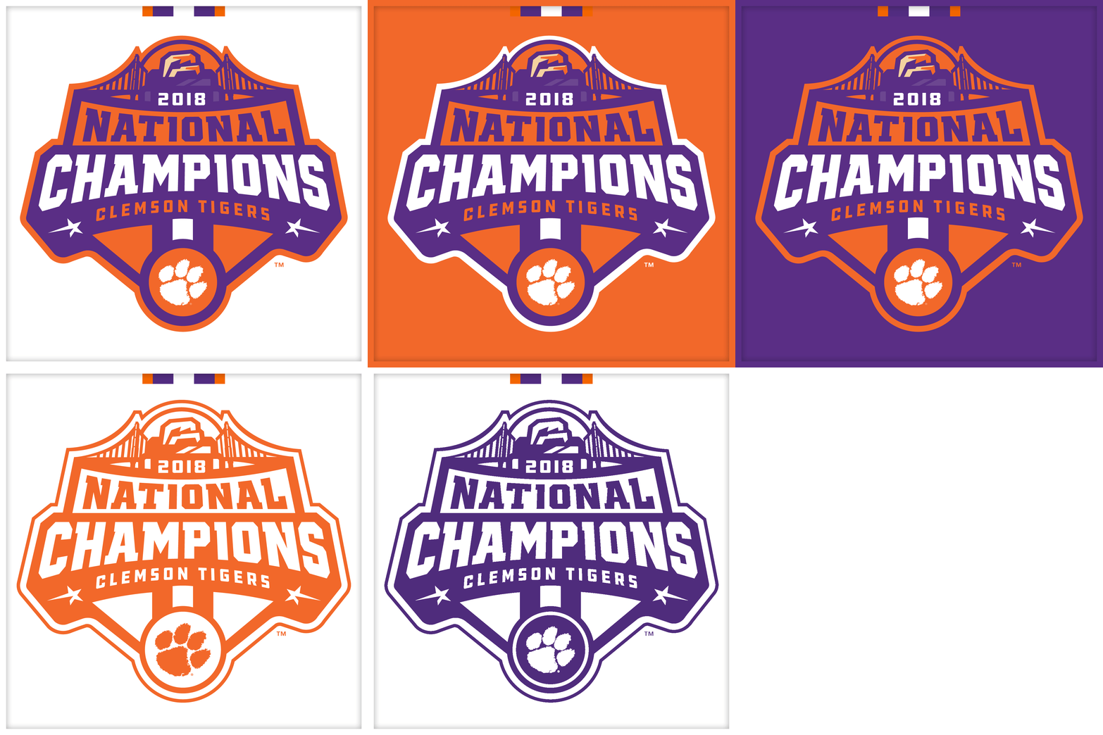
Other design elements of note:
- The game was technically in Santa Clara but the design decision was made to feature the Golden Gate Bridge to represent the entire “Bay Area” of California
- Inclusion of Howard’s Rock allowed for a double meaning: The Rock that sits atop Clemson’s famous Hill inside Memorial Stadium as well as Alcatraz, also known as “The Rock,” a famous landmark located off the coast of San Francisco
- The two stars at the bottom are references to Clemson’s other National Championships in 1981 and 2016
Clemson worked with licensing partner IMG College Licensing to utilize the logo on officially licensed items, including hats, shirts, logos and other souvenirs — more than 1,000 items in total.
“We just like to be unique at Clemson and do things a little differently,” Kallin said. “We knew our fans would appreciate that a Clemson graduate was the person who designed the logo and it would mean more that way. I’m really happy T.J. was that person.”
All thanks to a rainy day and a baggage delay.
As Harley said, “If it had been sunny that day in Orlando, this may never have happened.”


